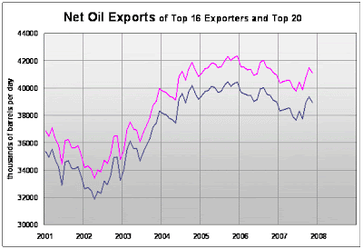
Net Oil Exports - December Update. Top 16 Exporters (90% of total exports) in blue, Top 20 Exporters (93%) in Pink.
Click on following link to download updated Excel spreadsheet(430kb):
scroll down to bottom of linked page and hit orange button on right and
then hit second prompt if download doesn't start immediately


6 comments:
2008 is going to be an interesting year.
+ BIG projects coming on-line with maybe a gross addition of 6-7 Mb/day in 2008 and another 5 Mb/day in 2009
- accelerated decline in existing production
- increasing internal consumption in oil producing nations
- demand growth from China and India strong in the foreseable future
Can Net Oil Exports (top 20) exceed 42 Mb/day once again?
My bet is barely in 2008-9. From then on its downhill...
I haven't heard of this 6-7Mb/day, where is that coming from?
You can read all about it on Wikipedia "Oil megaprojects". It´s Stuart Staniford, Kehbab, Ace (from The Oil Drum) and others, that has collected known big projects coming online over the next several years.
But remember, it is a gross figure of new oil-projects. Taking into account decline, delays and overestimates of peak production etc, 6-7 Mb/day will probably be reduced to 1 maybe 2 Mb/day of higher total production.
And that´s not even considering net export capacity...
What would greatly enhance the usefullness of this graph would be to have the top 16 or 20 importers superimposed so it would be obvious who is becoming the loser.
I definitely read the comments on a very regular basis. If I don't respond, it doesn't mean anything. It doesn't mean I don't totally appreciate comments. Sometimes I have to think about things for months before being able to answer.
I follow the wikipedia megaprojects thing fairly closely. It just got started. I'm primarily interested in seeing how long they can keep up that level of work.
To the reader who commented on the superimposition. I'm not sure what you mean. If you could be more descriptive I could try some things out.
One of the reasons I provide the full spreadsheet in the easy to use form that I do, is so that I have no monopoly on what I can do with the available data.
a couple hours playing with Excel graphing gives anybody the ability to enhance the usefulness themselves.
Your net export graph shows whats left over for the oil importing countries. All I was suggesting was that you show explicitly what each importing country is getting of this pool of oil.
The top 16 importers should consume most of the exports so that if you showed a summary graph by country, it should be about the same total as all the exports.
Consuming 31% of the total would be the USA, next would be Japan and so forth. Each band would be a country's consumption.
The result would show at a glance which countries are losing out in the competition for oil.
Post a Comment